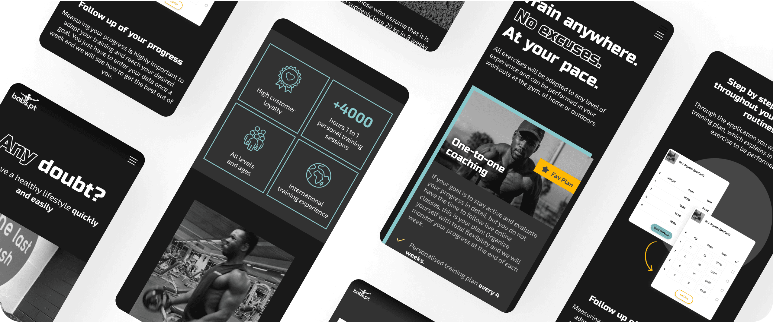
Transforming a personal training brand to cater to its users' unique needs
WEB REDESIGN
2021
SIDE PROJECT
TEAM
PROBLEM
The main problem lies in the lack of trust generated by a design that presents an information overload, a non-intuitive interface, and an inconsistent design. As a result, the website fails to convey confidence or provide an optimal user experience.
MY ROLE
In this project, we formed a team of three individuals with specific and complementary roles. My primary role was as an expert in interface design, user needs analysis, and design systems. I focused on creating an intuitive and visually appealing user experience, as well as designing interfaces that were both aesthetically pleasing and functional.
SOME DATA
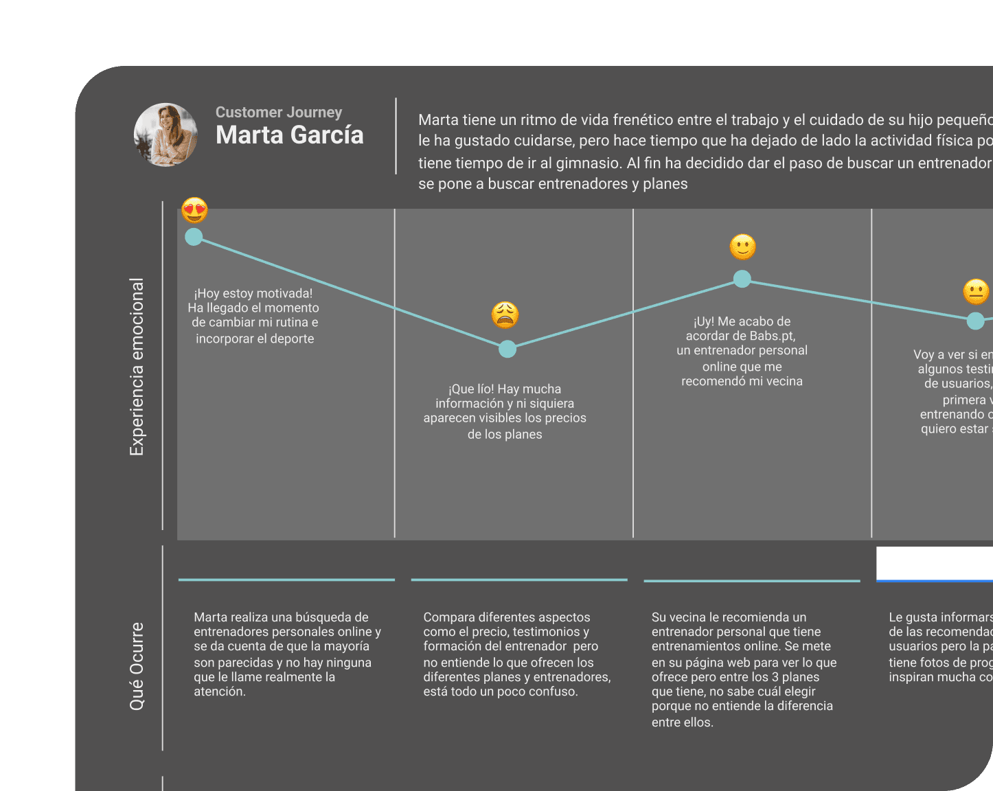
A total of 90 users were surveyed, and 5 interviews were conducted. The findings indicate that 63.9% of the users have experience with online training. Additionally, 65.1% consider price as an important factor in their purchasing decision. Regarding personal trainers, the most valued attributes are their professionalism, education, and experience.
SOLUTION
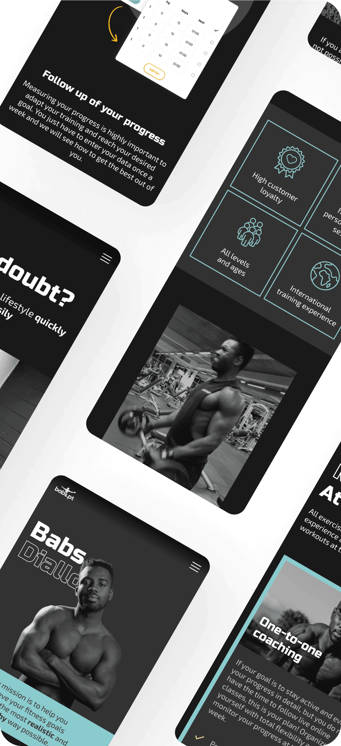
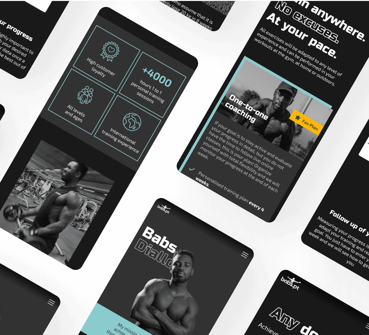
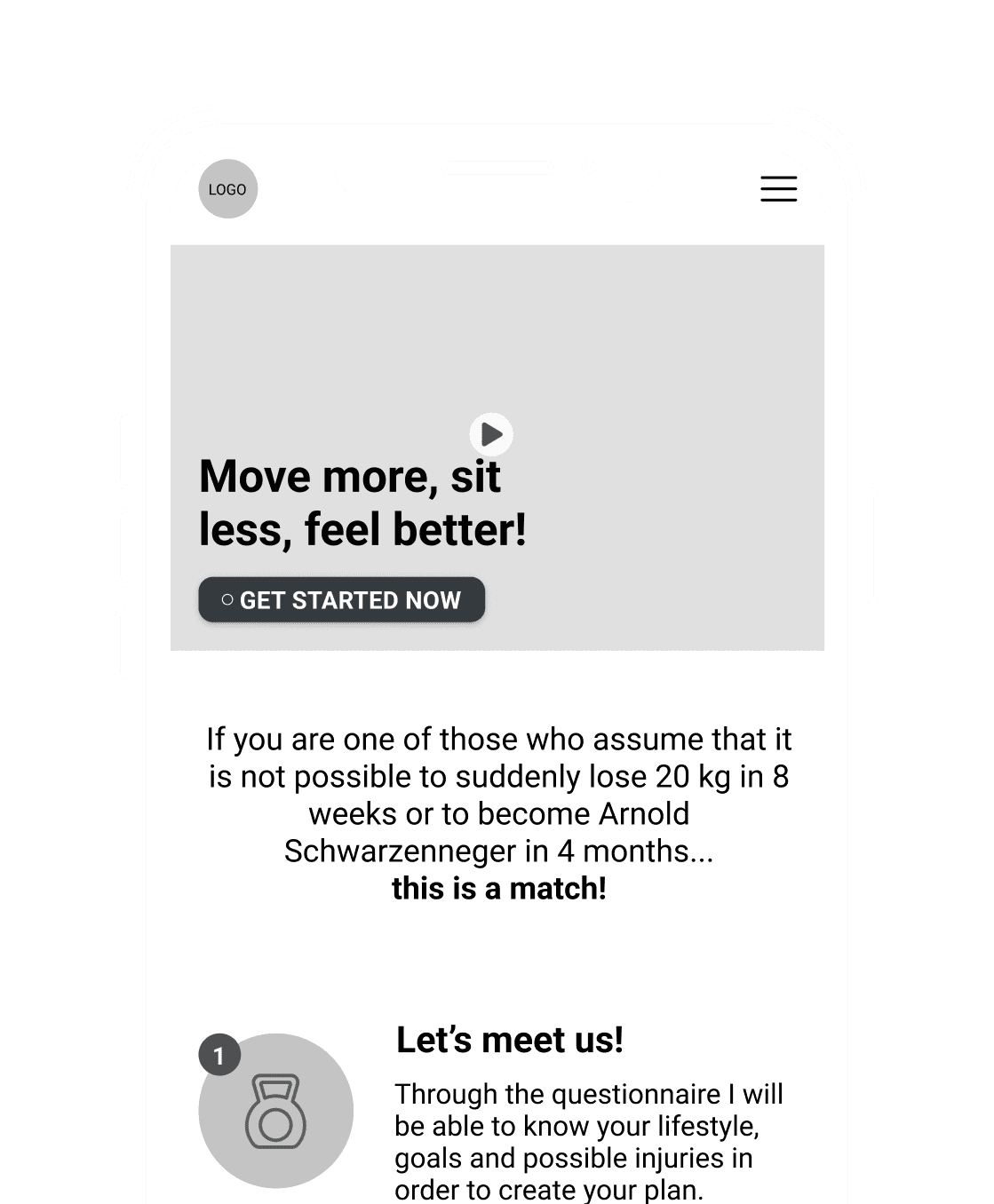
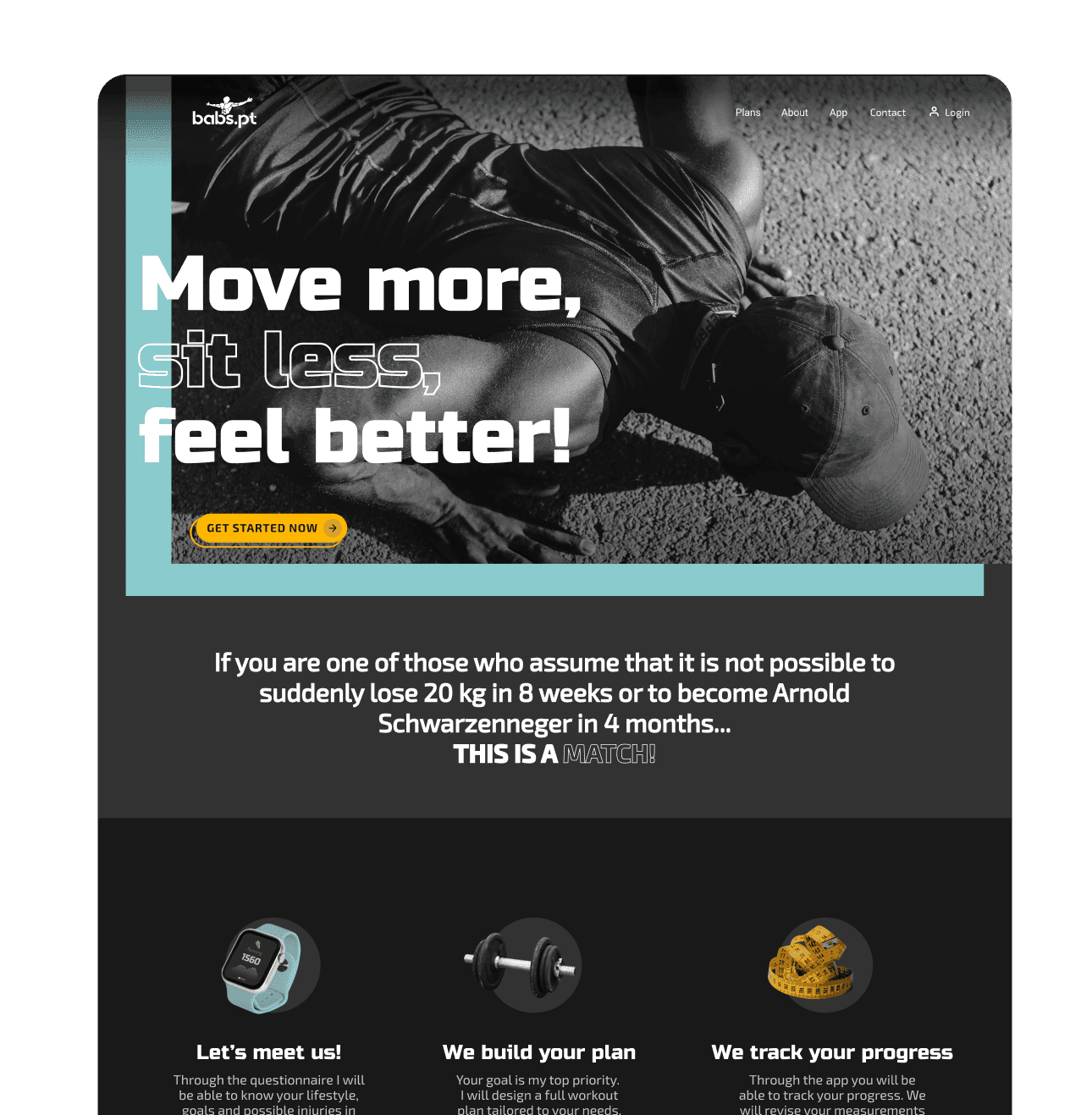
Our main objective is to optimize the design to create an intuitive interface, eliminating information overload and ensuring a consistent visual appearance. Additionally, we aim to develop an identity that aligns with the client's strengths, highlighting their personality on the website and generating coherence across all aspects. This way, we will achieve a website that inspires trust and provides an exceptional user experience, meeting the needs of visitors and highlighting the uniqueness of the personal trainer.
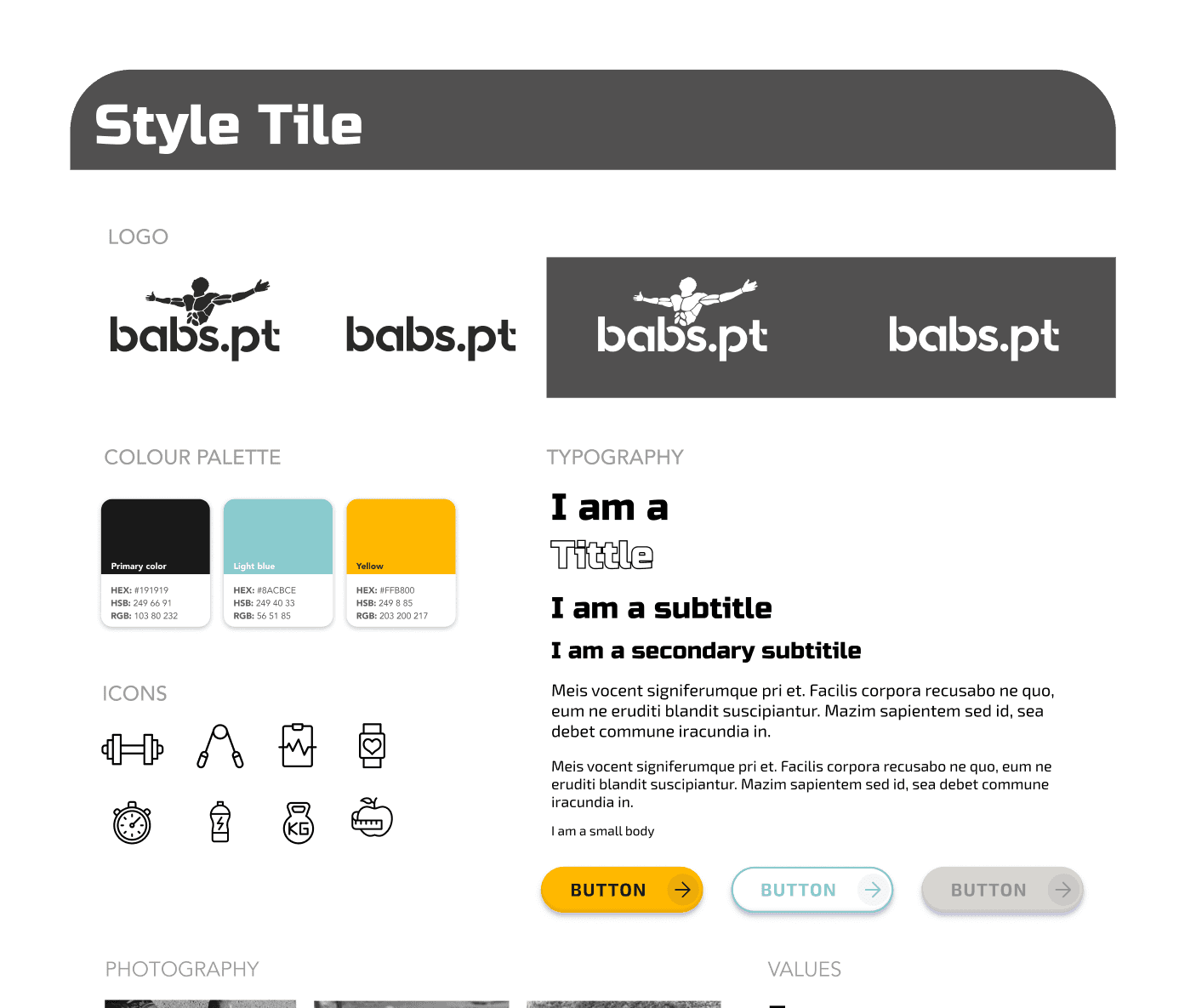
VISUAL IDENTITY
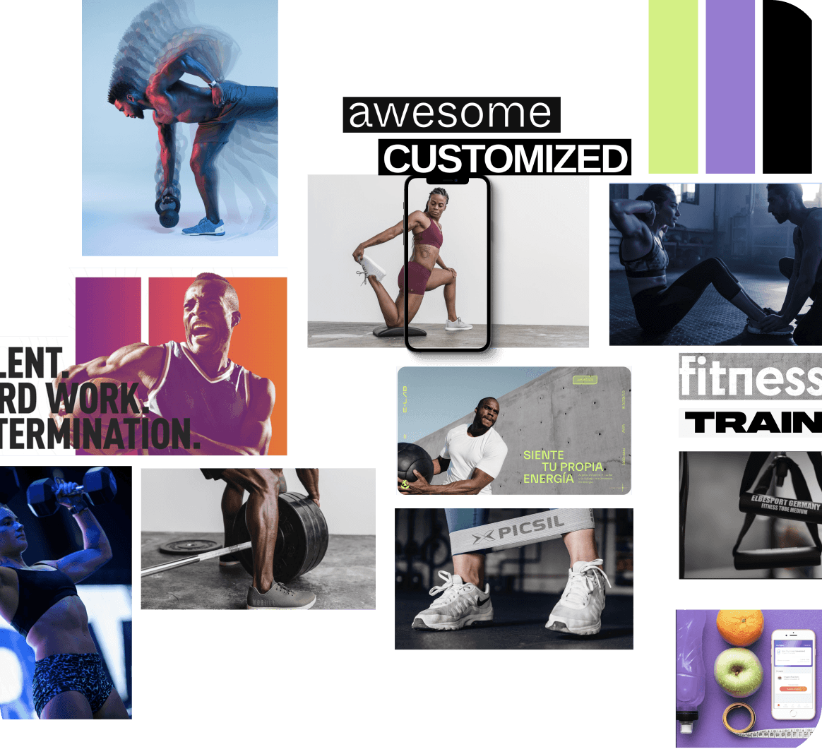
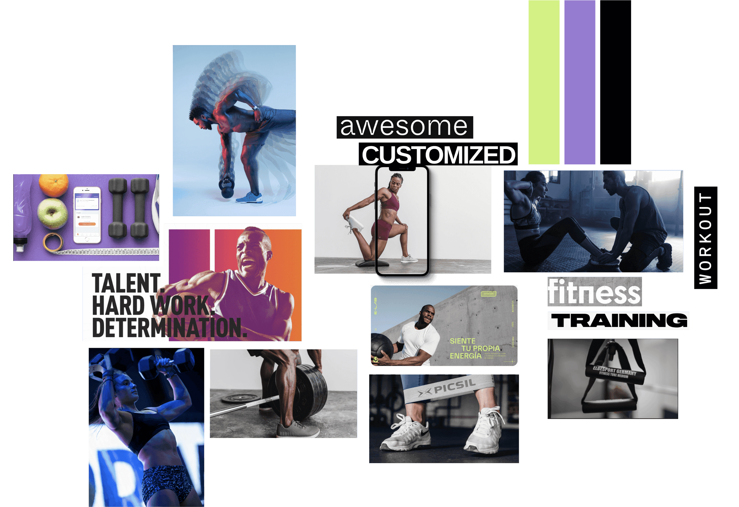
With the goal of conveying the personality of the personal trainer, we have chosen to design a close and vibrant identity. This identity reflects the professionalism of Babs Diallo while also showcasing their commitment to the progress and improvement of their clients' health at a suitable pace.
HANDOFF AND DEV
After testing the design with multiple users and the stakeholder, it was time to prepare everything for development. We carried out the development ourselves using the Webflow tool, which allowed us to adapt the design responsively and set up CMS sections so that our client can update the information that needs to be changed at any time.
CHALLENGES
One of the main challenges we faced was the need to adapt certain parts of the design to the limitations presented by the development platform.

Cristina Deniz: UXUI designer + visual design specialist

Laura Martínez: UXUI designer + Copywriter specialist

Laura Larrosa (me): Product designer + design system specialist


