Building and scaling Lumen, our design system for My inmo
DESIGN SYSTEM
2024
SIDE PROJECT
TEAM
THE PROJECT
Welcome to the birth of Lumen, our shining star of a design system, created in tandem with the development of My Inmo, a platform aimed at revolutionizing how real estate professionals manage property sales and post-sale processes.
MY ROLE
I’m the solo designer in a squad of three developer friends. From crafting the brand identity to building out the design system, I’ve got my hands full. I also lead user research, shape product decisions, and work hand-in-hand with Sergio, our lead developer and business strategist, to steer the platform’s direction. Multitasking? It’s a lifestyle.
THE CHALLENGE
Forget UI kits! I decided to skip the training wheels and dive straight into building a full-blown design system from scratch. My goal? Not just to create something that looks good but to ensure that every component, every interaction, and every button feels like a well-orchestrated dance of usability and aesthetics. Oh, and did I mention accessibility and scalability? Yeah, those too.
OBJECTIVE
The goal of Lumen is simple: create a unified, accessible, and visually consistent design language for My Inmo that helps us scale smoothly. It’s all about laying down a solid foundation so we’re not playing catch-up later.
DESIGN PRINCIPLES
Illuminating the path
The design should guide the user step by step. Every component should make it crystal clear what the next action is and remove any doubt about how to move forward. It’s like giving your users a GPS with perfect reception.
Accessibility by default
Every component must be accessible by design. High-contrast colors, legible fonts, keyboard navigation, and screen reader support are non-negotiable. Accessibility isn’t an afterthought—it’s built right in.
Creativity consistency
Visual and functional consistency is important, but it shouldn’t stifle creativity. The design system must allow controlled variations to accommodate special cases without breaking overall coherence. Think of it as a well-oiled machine that can occasionally break out into a jazz solo.
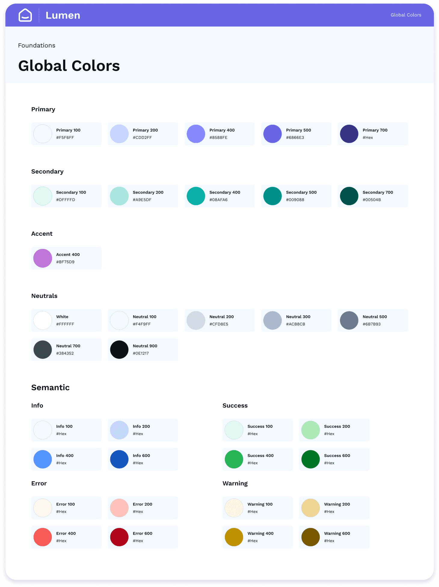
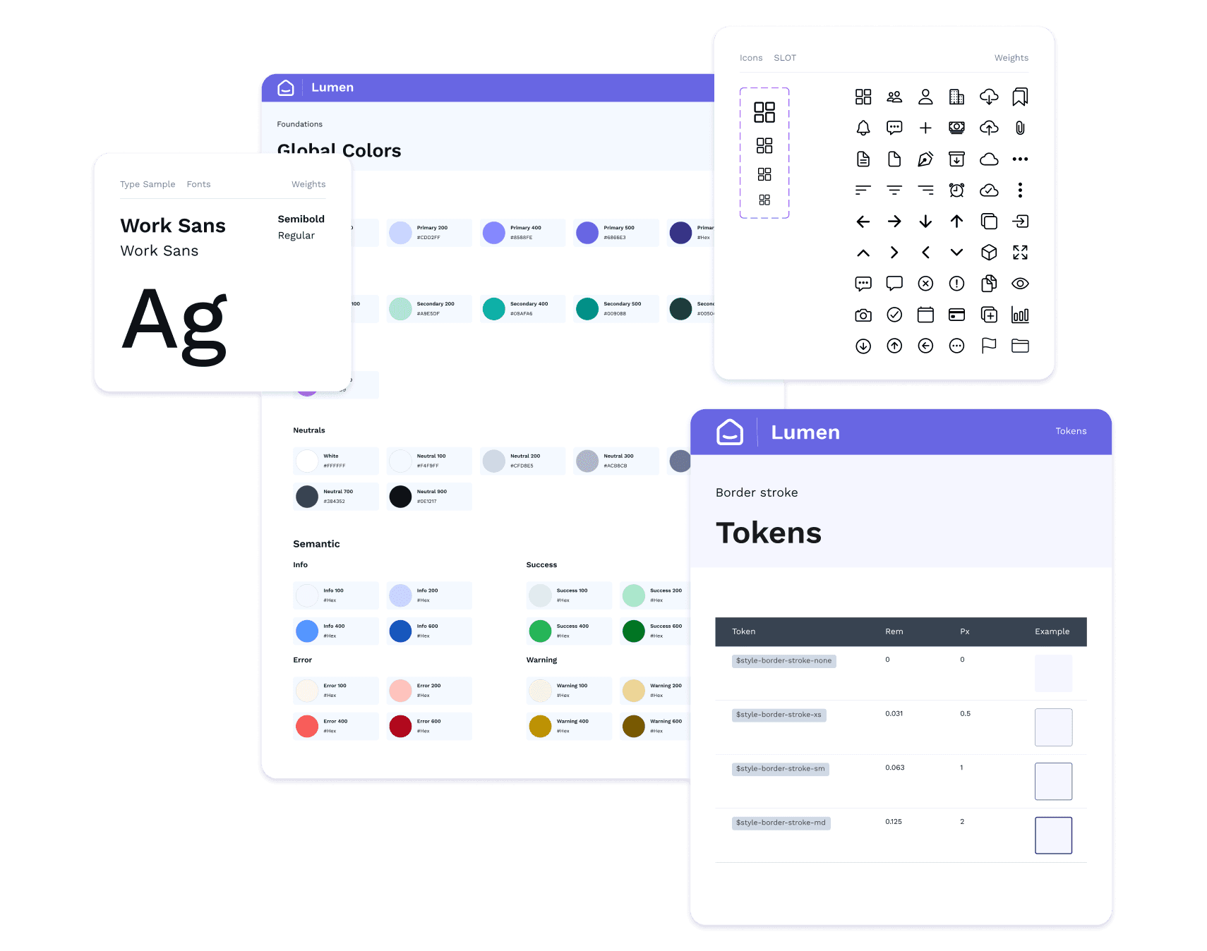
COLOR
When defining the visual identity for My Inmo, we aimed to convey a brand that’s reliable, modern, approachable, supportive, and enthusiastic—a trusted partner that’s easy to use and in tune with real estate passions. At the same time, accessibility was a top priority, so we chose a color palette that reflected these traits while meeting accessibility standards. We used OKLCH Color Variations to ensure our colors were compliant and inclusive right from the start. No shortcuts!
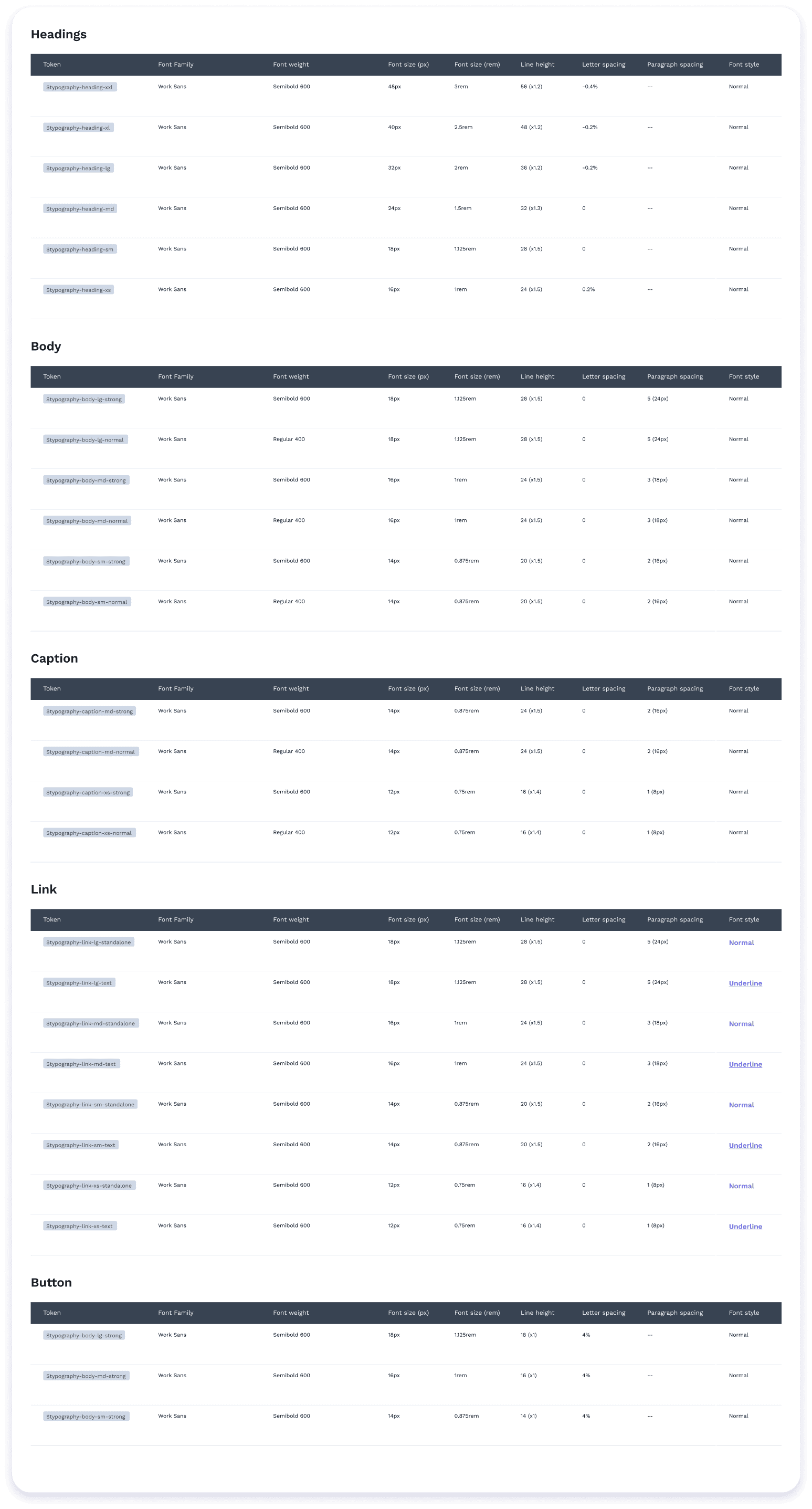
GLOBAL TOKENS
Tokens are our secret weapon to make scaling easy with the dev team. Right now, we’ve established global tokens to lay a strong foundation, giving us the flexibility to scale as the platform grows. Whether it’s colors, typography, spacing,… everything is locked in with tokens, so we can adjust and expand without breaking a sweat (or a design).
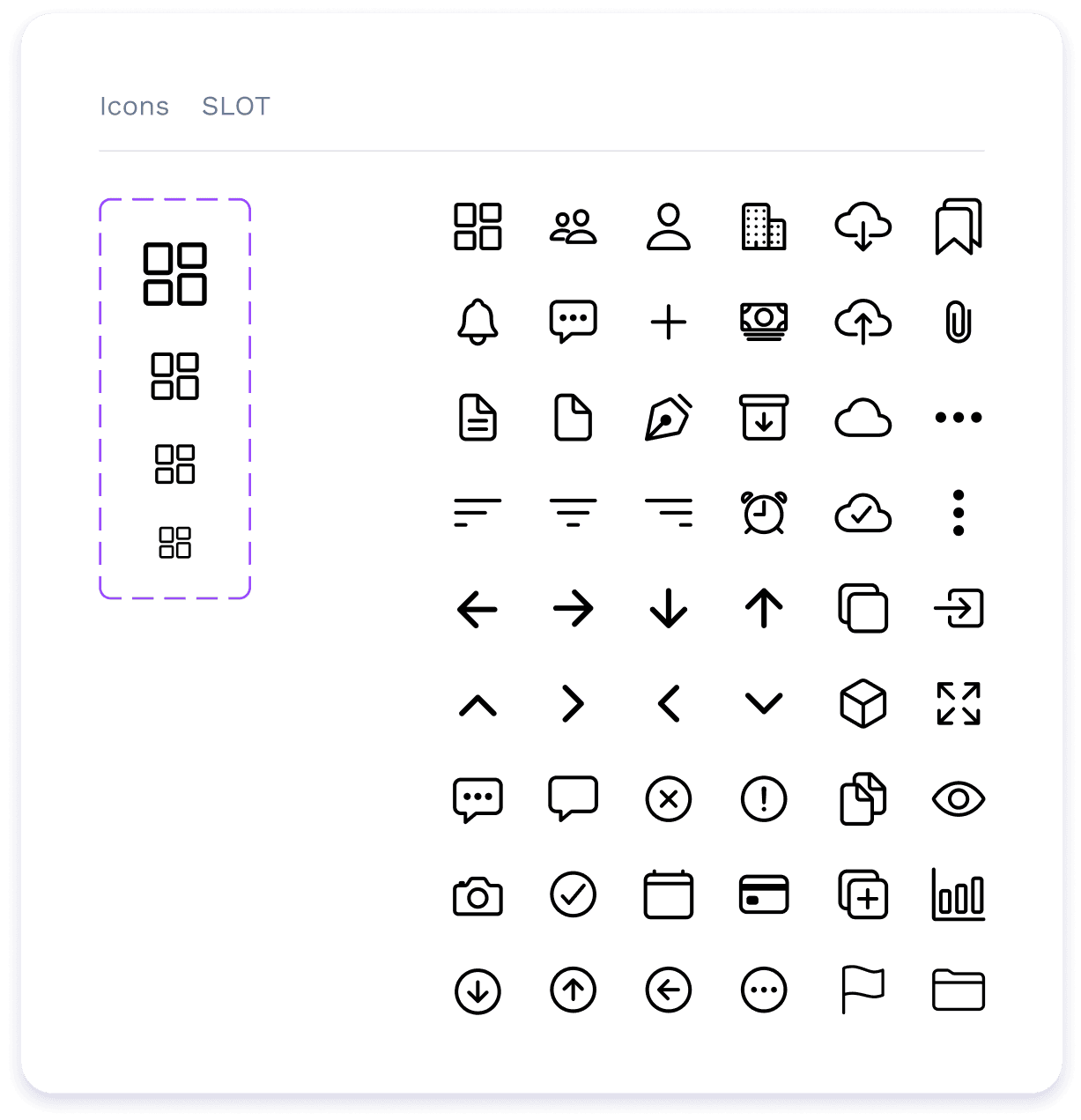
ICONS LIBRARY
We made a call to keep the icons in a separate library to make scaling easier and simplify maintenance. Right now, we’re using outline icons from Ionic Icons, but if we ever need to create custom icons, we can make them while maintaining the same look and feel. It's flexibility at its finest, without getting too complicated.
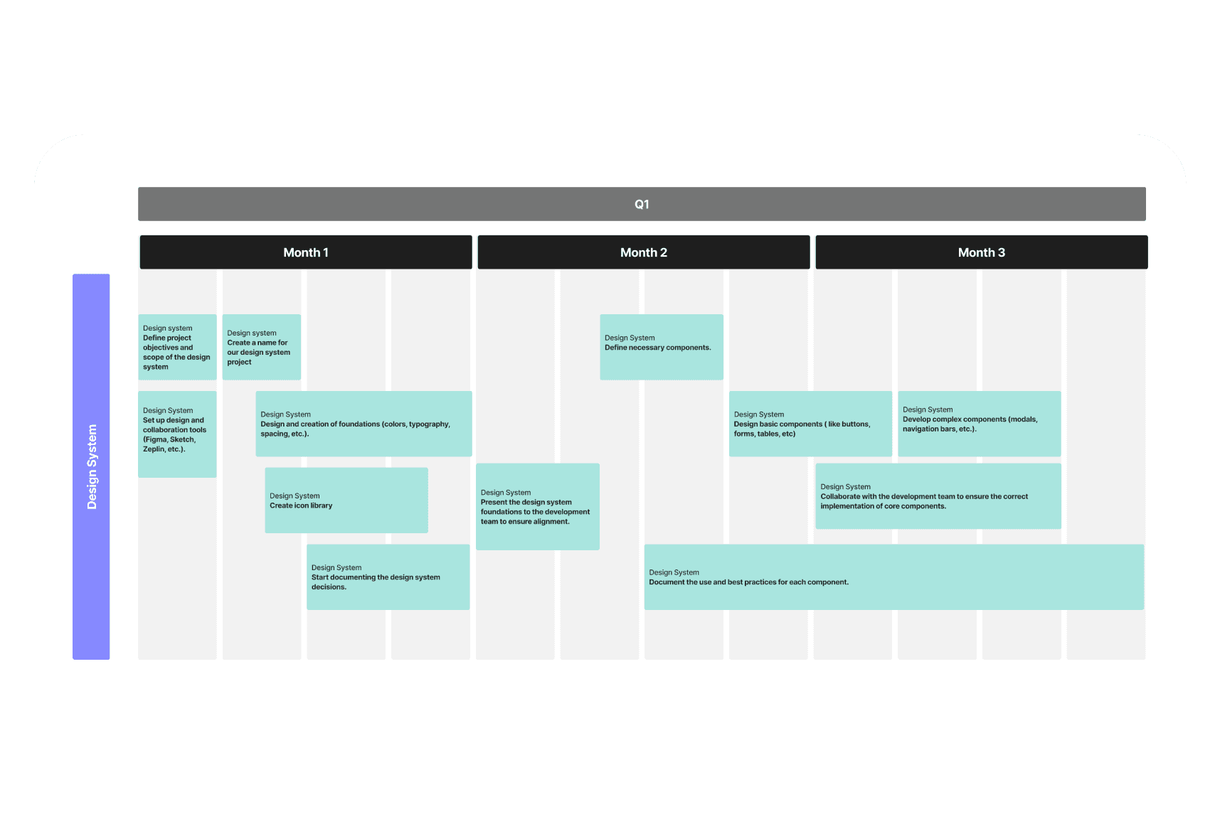
NEXT STEPS
Color Tokens
We’ll start defining specific tokens for colors, prioritizing common tokens that are context-related. If necessary, we’ll dive into component-specific tokens for more granular control.
Component Library
We’re preparing to build the component library based on the platform’s needs. We’re still gathering insights from user research and testing, so we’ll soon know exactly what components are essential.
Documentation
This is crucial for good communication, especially since we work asynchronously. While documentation is often left for last, we want to build it from day one for both foundations and components to avoid any gaps.
TO BE CONTINUE…
This is just the beginning of Lumen. The system is growing alongside My Inmo, and we’re excited to see where it takes us. Stay tuned for more as we keep shining a light on great design (pun very much intended).

Sergio
Full stack developer and CEO

Sebas
Back-end developer

Luca
Back-end developer

Laura (me)
Product designer + design system specialist